

In a sea of brands at an event, it can be hard to stand out from the crowd.
So, how do you draw attendees in and get them to enjoy their experience? One way is by implementing color psychology.
Different colors evoke different emotions. This blog will break down how each color may make your attendees feel and how to use color wisely in your brand experience design. 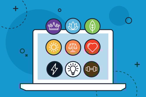
Using Warm Colors in Your Design
Warm tones like red, orange, and yellow are the colors of excitement and energy. Use these in your brand experience design to make attendees feel energized about your brand.
Red: The color red expresses feelings of passion and action. Try incorporating red in a fun game or activity to get attendees excited and engaged.
Orange: Orange represents creativity, adventure, and balance. Orange is a lively color that could be used to show off the playful side of your brand.
Yellow: Yellow is associated with sunshine and happiness. Using yellow in your event helps attendees feel optimistic about what your brand has to offer.
Using Cool Colors in Your Design
There’s nothing more relaxing than sitting on the beach under a light blue sky while watching the deep blue waves crash along the shore, right? Cool colors like blue, green, and purple have a calming effect. When you choose a cool color palette, you’re inviting attendees to engage with your brand in a more mellow way.
Blue: Shades of blue give attendees feelings of peace and tranquility. Blue is also known to build trust, and it can give attendees a sense of security while interacting with your brand.
Green: Green is the color of growth, health, and generosity. Using green may help attendees interpret your brand’s product or service as a wise, healthy choice for them.
Purple: Purple is often associated with royalty and wisdom. Purple blends the excitement of red and the calmness of blue, creating a balancing effect among attendees.
Using Neutral Colors in Your Design
Neutral colors like black, white, and brown are tasteful and timeless. They can serve as a great backdrop to your experience design.
Black: In design, black evokes power, strength, and sophistication. Black draws attendees in by adding an air of mystery to your event experience.
White: White is connected with minimalism and clear thinking. Using white in your design could eliminate distractions and encourage attendees to focus on thinking about your product/service.
Brown: Brown is an earthy color that brings a sense of strength and reliability. Including brown in your event experience design can help attendees feel grounded and believe your brand is dependable.
We Can Help You Build An Incredible Brand Experience
At Hamilton, when creating your brand experience design, we consider everything, including the meaning behind each color choice. We can help you build an immersive, engaging brand experience that will wow your attendees. Contact us today to get started.